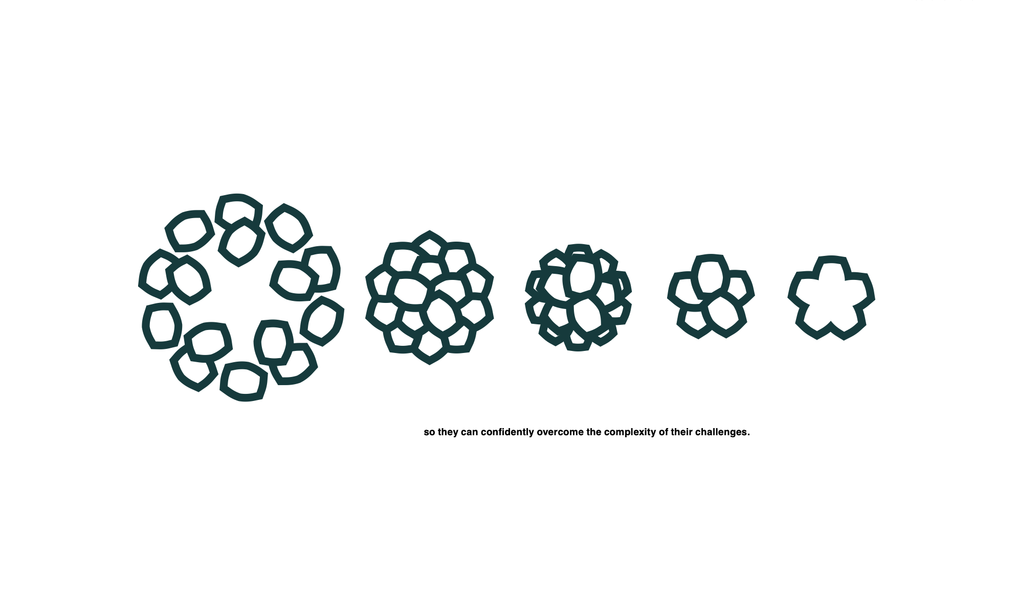
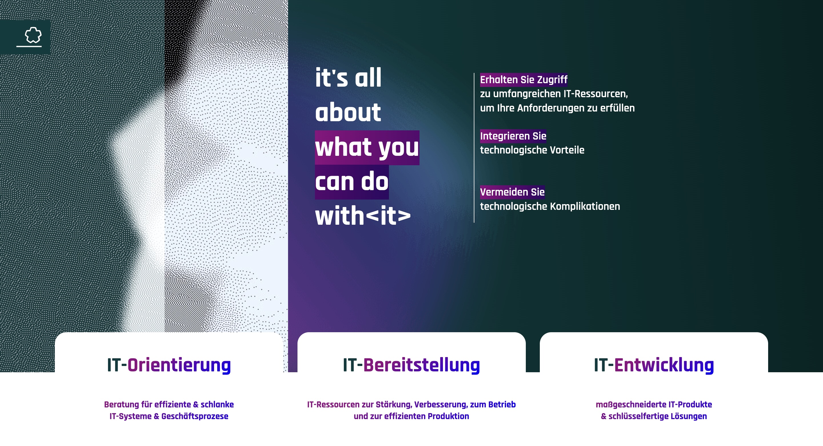
The transformation represented a real organizational change and at the same time the starting point for the development of a new visual corporate identity.
For pure_solution, the main focus was on a clear repositioning in the market. The company has existed for more than 25 years and counts several large corporations among its clients. The new goal, however, was to approach small and medium-sized enterprises (SMEs) more actively in order to scale further in this segment.
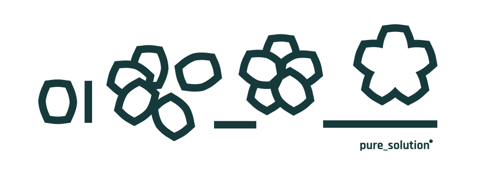
To achieve this repositioning, an internal company analysis was conducted, which led to structural and process-related changes. To give this change greater expression, a rebranding was also carried out. The rebranding emphasizes—both visually and in content—that pure_solution is an established and reliable IT company with decades of experience. At the same time, the new identity was designed to appeal to a younger generation of decision-makers—particularly executives between the ages of 30 and 40—and to build trust.

During the analysis, it became clear that the existing logo, which merely displayed the name “PureSolution” visually, did not reflect the company’s values and identity. The new branding, therefore, makes the true essence of pure_solution visible: experts from different fields coming together to create tailored, customized IT solutions.
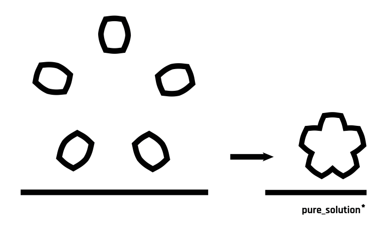
The result was a comprehensive rebranding, introducing a five-pointed asterisk as the new symbol. This symbol represents several levels of the company’s identity:
- The star as a metaphor for uniqueness and tailor-made solutions,
- The character from coding languages, where it holds significant meaning,
- The human aspect, representing both the company’s own experts and its clients.
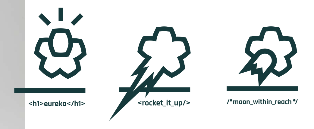
In addition, the logo can be flexibly adapted in various ways, creating strong recognition value.
Alongside the visual realignment, internal processes were also restructured and gradually implemented, ensuring that the rebranding signified not just a new visual language but also a holistic transformation in the company’s appearance and way of working.
The result is a brand that combines 25 years of IT expertise and tradition with a modern, future-oriented presence.




More projects
Strategy development, Corporate Identity, Web Design, Login Area
Jibbern did not need a single solution, but a complete digital ecosystem.
Jibbern
Database Synchronization
A simple idea minimized the workload enormously.
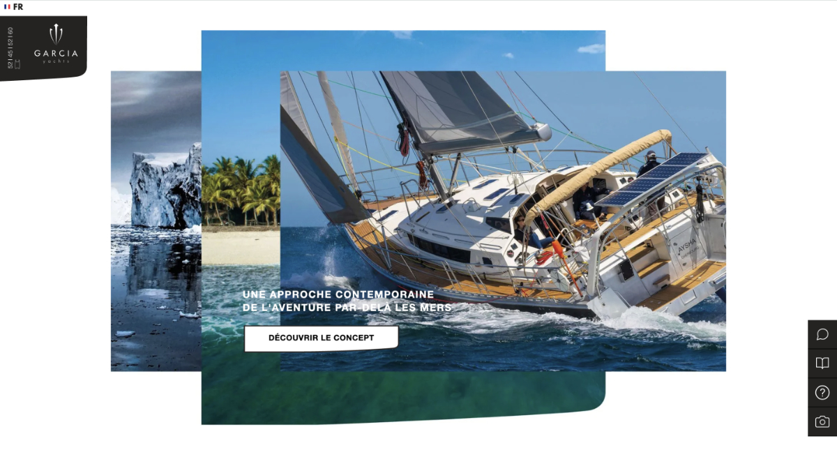
Garcia Yacht
